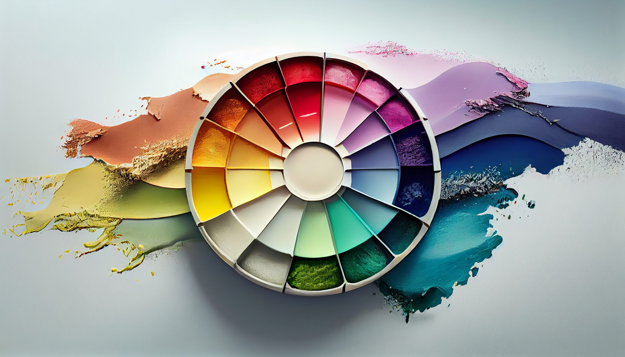
The Role of color in website design is often underestimated, but it can make a significant impact on how visitors perceive and interact with a website. The use of color can help to create an emotional connection with users, guide them through the content, and even influence their behavior.
One of the most important aspects of color in website design is its ability to create a visual hierarchy. By using contrasting colors, designers can make certain elements stand out more than others, guiding the user’s eye towards important information such as calls to action or key messaging. This can help to improve the user experience and increase engagement with the website.
Color can also be used to convey meaning and emotion. For example, the use of blue is often associated with trust and reliability, while green is commonly associated with growth and nature. By choosing colors that align with the brand’s messaging and values, designers can help to reinforce the brand identity and create a more cohesive experience for users.
In addition, the use of color can also influence user behavior. Studies have shown that the use of red can create a sense of urgency and encourage users to take action, while the use of blue can promote a sense of calm and encourage users to stay on the website for longer periods of time.
However, it’s important to note that the use of color in website design is not a one-size-fits-all solution. Different colors can have different meanings and associations in different cultures, so it’s important to consider the target audience when choosing a color palette. Additionally, the use of too many colors can be overwhelming and distracting, so it’s important to strike a balance between visual interest and usability.
In conclusion, the role of color in website design should not be overlooked. By using color strategically, designers can create a more engaging, cohesive, and effective website that resonates with users and helps to achieve business goals.

